

9477654
Statements
37294
Actors
114142
Activities
1981
LRSs
Veracity Learning offers several ways to generate custom dashboards. At the most basic level, you can place widgets (graphs or tables) on a dashboard page. Each widget is customizable with a set of options like what actor, what object or what verb to use. Beyond that, we offer a set of highly flexible widgets that can be used to build custom bar, pie and line charts. These widgets include a point and click interface to build many common queries. We also offer a fully customizable Aggregation widget, which uses the same query language as our aggregation endpoint. This widget allows you to build very sophisticated analyses and pair them with a huge variety of graphic options.
For onsite, enterprise customers, your server can be customized with additional widgets through an easy to use API.
The most basic way to get additional insight into your data is to use our custom dashboard feature. Each custom dashboard can have a set of configurable widgets on it, each of which shows a graph or table.
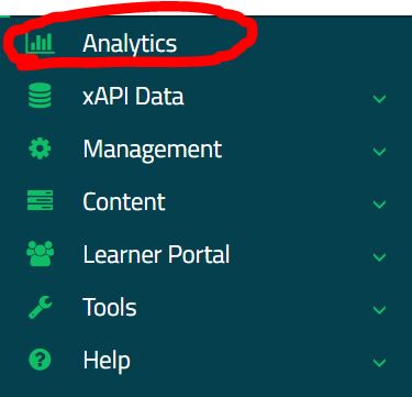
Start by loading the analytics page for your LRS. Do this by clicking the "Analytics" button on the left side menu.
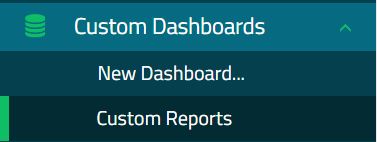
Then open up the "Custom Dashboards" menu item on left, and find "New Dashboard".

This will create a new custom dashboard with the default title "Custom Reports". From here you can add widgets, configure widgets, and set the title. Click the "Edit Dashboard" button.

Add a widget.

You'll now see a popup with a list of widget types you can select. See below for a description of all the various widgets available. Choose a widget from the list by clicking on it.

When you select a widget, one will be added to the dashboard. It will appear at the end, so if you have many already, you might need to scroll down to see it. New widgets are set up with their default configuration. For some widgets, the defaults produce a graph, but others require additional configuration before they will work.

Widgets can be removed, sorted and configured with the icons on the top right. These are only visible when the dashboard is in "edit" mode. Click the "Configure Widget" icon.

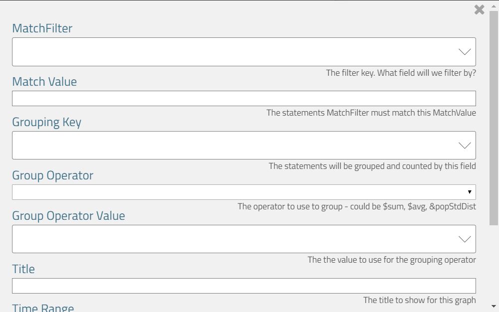
Every widget exposes a set of parameters that can modify how the widget works. Generally, widgets expose properties to help scope their graph to a particular actor, object or verb. Many also allow you to override the global time range.

Many of the fields in the widget configuration search your database to suggest values. Begin typing in these fields to search for object, actors, or verbs.

You must click "Ok" to save the parameters. Use the grey "X" in the upper right to discard the changes. You might find that your parameters result in an empty graph. This simply means that there is not enough data to display a chart. Note that when you exit edit mode, widgets without enough data to display will be hidden completely.

You can set the title of the dashboard with the "Set Title" button. Click "Ok" to save the title.

All custom dashboards will be shown on the list in the left hand menu. Anyone with analytics permissions on the LRS can view these dashboards.
The following widgets are available to be placed on a custom dashboard. If you have an onsite enterprise installation, your custom Analytic Processors will be listed as widgets along with the built in options.
A line chart showing activity for a given object. Allow selection of the object, verb type, and time span. Can be limited to an actor or activity.
A pie chart showing the proportion of statements from each Authority. The Authority is used to identify the source of a statement, and is usually (but not always) associated with an access key.
A bar chart of the top objects for a given verb. Can be limited to an actor or activity.
A line chart showing activity for a given object. Allow selection of the object, verb type, and time span. Can be limited to an actor, activity, verb or combination.
A stacked bar chart of most active actors, stacked by verb type. Can be limited to a specific Activity.
A pie chart showing the most active objects. When pie pieces are clicked it will drill down into the object overview dashboard. Can be limited to a specific actor.
A bar chart showing the relative frequency of verbs. Can be limited to a single actor, activity, or combination of each.
A table with general stats about this activity.
A table with general stats about an actor.
A table of statements. You can choose which actor, verb, or object.
A highly customizable generic bar chart.
A highly customizable generic pie chart.
A highly customizable generic bar chart.
A highly customizable generic time series chart. Groups by timestamps, with a value you can specify.
A line chart showing activity for a given context object. Allows selection of the object, verb type, and time span.
A generic statement viewer. No configuration other than date, but allows client-side searching and filtering.
Veracity Learning LRS exposes a highly customizable set of widgets that can build a huge variety of charts. These are the Generic Pie, Generic Bar and Generic Serial charts. Each exposes a query builder that will help you build complex queries.
In general, each works the same way, but renders the results differently. Let's look at the parameters for a generic bar chart.
These three widgets all work on the same principle. Filter all the xAPI statements into a smaller set, then group them into buckets by some criteria. For each bucket, we can compute the min, max, average or standard deviation for different parts of the statement.
Clicking the dropdown in "MatchFilter" will give you a list of fields from the xAPI statement specification.
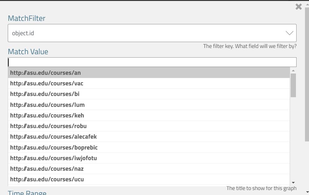
In this case, we've selected the Object.id value. Clicking in Match Value will list the top hits for this value. In this case, the courses listed are the most requested object ids used in xAPI statements. You can also type words into the box to search.
The grouping key works the same way - we are selecting which part of the statement will be used to group the statements. In the example below, we create groups by the verb.id. So, wherever the verb.id is the same, we create another bar in the bar chart.
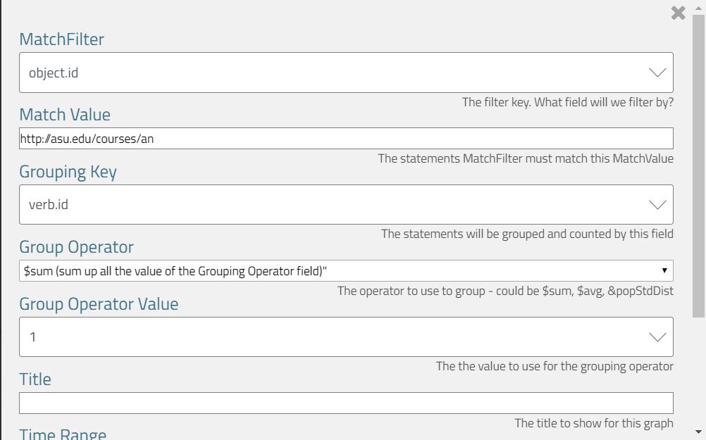
The grouping operator tells us what metric to compute. The sum, average, or deviation?
The group operator value tells Veracity Learning LRS where to get the values. Choosing a grouping operator of "sum" and a grouping operator value of "1" means "Count the statements that went into each group."
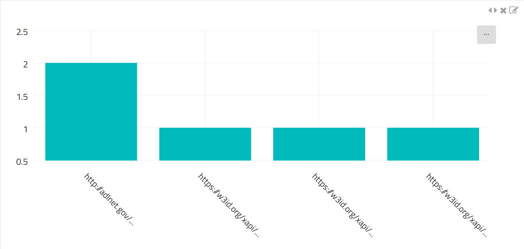
So, the setup below gives us a bar chart of the total statements for each verb where the object.id is "http://asu.edu/courses/an"
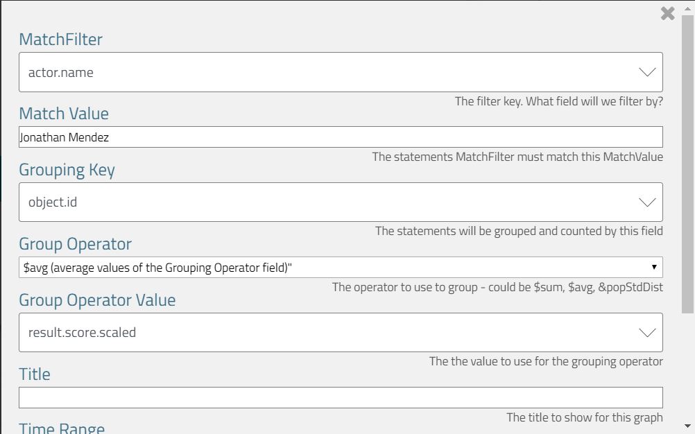
The setup below would create a bar chart showing the average score of all statements on each object where the actor name is "Jonathan Mendez". Each bar will represent one object.id, and the height of the bar will be the average score for that actor on that object.
For most common scenarios, we've created specific widgets, so you don't have to create your own custom query for most cases. However, the generic graphs are the only way to generate charts over xAPI Extensions.
You can use a special syntax to ask the chart to use an extension. Instead of choosing from the list, you can type statement.context.extensionname.
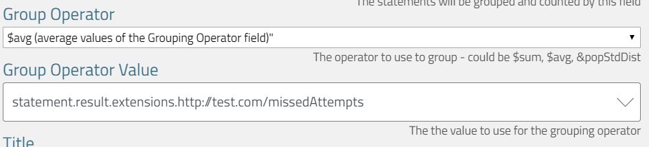
You must add the statement. prefix to the path name to let the system know you wish to select an extension. The xAPI specification allows for several extension points
In the future, you'll be able to use a similar syntax to access statement metadata, like the IP address, session identifier, or even the HTTP headers.
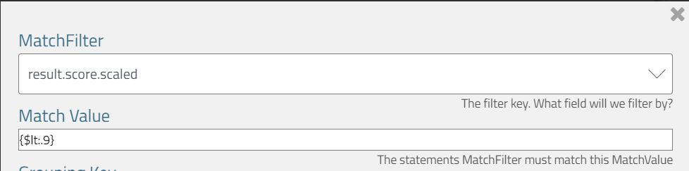
You can even add complex conditions to the Match Value. If you provide a JSON string, it will be used as the match value. This JSON can use the MongoDB query language query language to specify conditions.
Here, I've added a "less than" operator to the scaled score query.
You can even use top level logical operators like "$and", "$or" or "$not". In the image below, I've pasted the following into the Match Value box
   [
       {statement.result.score.scaled: {$gt:.3} },
       {statement.result.score.scaled: {$lt:.9} }
   ]
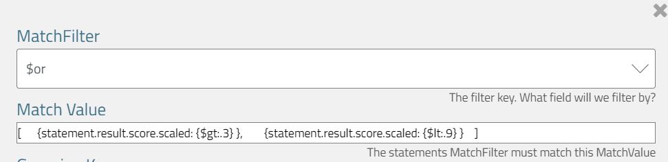
This selects statements where the score is greater than .3 or less than .9.
If this is still not flexible enough for your needs, read on to the next section.
The most flexible, generic and powerful tool available (without writing a plugin widget in the enterprise version) is the Aggregation Widget. This tool marries up the aggregation query API with the charting and dashboard system.
You can input an entire aggregation pipeline algorithm, and map it to a graph. This tool also exposes the full configuration for the graphing system, so you can change colors, borders, orientation, or even use other graph types like a funnel chart, candlestick chart, or even a world map.
Check out AmCharts for full documentation on the possibilities.
When you open the setup for the aggregation pipeline widget, you'll find 2 large text boxes - one for the aggregation pipeline query, and one for the graph configuration.
In the top box, you can input an aggregation pipeline in the JSON format. Read here for the format and syntax you can use here.
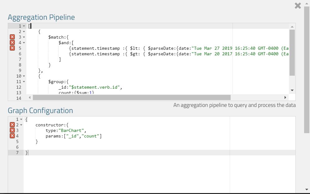
Here is a query that is set up to build a bar chart of the count of verbs. This pipeline is quite similar to the queries in the Generic Bar Chart section, but could be much, much more complicated. Here's what is rendered from this configuration.
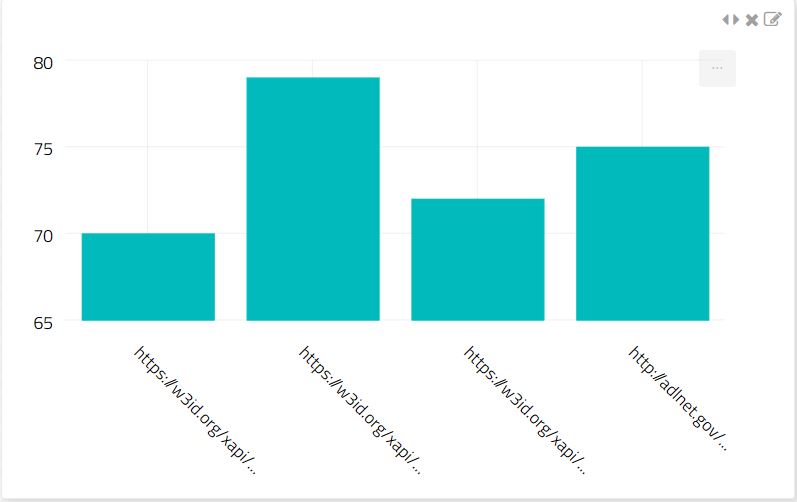
For reference, the query is the same as on the aggregation documentation page:
[
    {
        $match:{
            $and:[
                {statement.timestamp :{ $lt: { $parseDate:{date:"Tue Mar 27 2019 16:25:40 GMT-0400 (Eastern Daylight Time)"}}}},
                {statement.timestamp :{ $gt: { $parseDate:{date:"Tue Mar 20 2017 16:25:40 GMT-0400 (Eastern Daylight Time)"}}}},
            ]
        }
    },
    {
        $group:{
            _id:"$statement.verb.id",
            count:{$sum:1}
        }
    }
]
Note that we use a relaxed JSON parser. You don't need to add quotes around every property name. You can also use the $parseDate, $parseRegex and $parseNum operators to input dates and regular expressions.
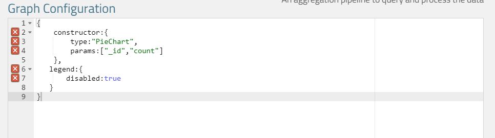
The second box is JSON to configure the graphic display. Veracity Learning LRS includes some common configurations that you can call on by including a "constructor" field.
{
    constructor:{
        type:"BarChart",
        params:["_id","count"]
    }
}
This Graph Configuration initializes a common template: a bar chart where "_id" is the name of the bar, and "count" is the value. Here are some other common templates you can load using the same technique
{
    constructor:{
        type:"BarChart",
        params:["_id","count"]
    }
}
{
    constructor:{
        type:"PieChart",
        params:["_id","count"]
    }
}
{
    constructor:{
        type:"SerialChart",
        params:["date","value"]
    }
}
{
    constructor:{
        type:"Table",
        params:["name","title","time","count"]
    }
}
Other than the Table, each configuration object represents a JSON chart config from the AmCharts library. Other properties will be merged into the configuration generated by the constructor.
The above configuration removes the legend.
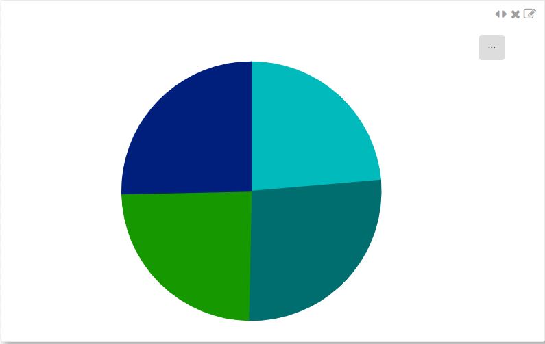
This example shows how you can change graph rendering properties.
{
constructor:{
type:"PieChart",
params:["_id","count"]
},
legend:{
disabled:true
},
series: [
{
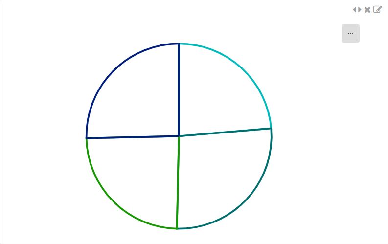
slices:{
fillOpacity:0,
strokeWidth: 3,
strokeOpacity: 1
}
}
]
}
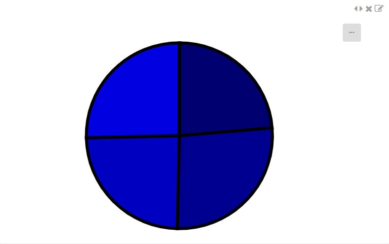
You can also set colors by providing a list.
{
    constructor:{
        type:"PieChart",
        params:["_id","count"]
    },
    legend:{
       disabled:true
    },
    series: [
        {
            colors:{ list: ["#000070","#000090","#0000C0","#0000E0","#0000E0","#0000E0","#0000E0","#0000ED"] },
            slices:{
                fillOpacity:1,
                strokeWidth: 5,
                strokeOpacity: 1,
                stroke:"#000000",
            }
        }
    ]
}
The constructor type set up the data series for you. You can generate multi-part graphs by overriding the data series we generate. You can generate multi series graphs like the one below. Here, we add a second data series. I'm not going to show it, but we added a second field to each computed slice.
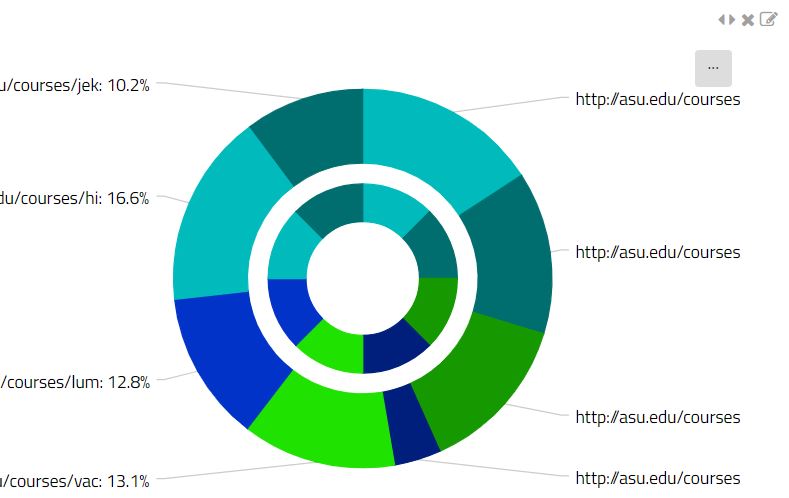
{
    constructor:{
        type:"PieChart",
        params:["_id","count"]
    },
    legend:{
       disabled:true
    },
    series: [
        {
            innerRadius:"30%",
            outerRadius:"60%"
        },
        {
            dataFields: { value: 'avgScore', category: '_id' },
            innerRadius:"61%",
            outerRadius:"100%"
        }

    ]
}
As you can see, you can create a vast array of different graphs with the Aggregation Pipeline Widget. Again, here are some references for the various JSON formats used:
Love this feature, but wish you could reuse each pipeline multiple times, with parameterized inputs? Read on to find out how to create totally custom widgets with Javascript and our analytics plugin features.